
Snow Swaps
Client: Snow Swaps
My role: Research moderator, wireframing, prototyping
Goals:
Uncover the degree to which the app offers the same perks and benefits that are offered in in-person swaps.
Understand the problems SnowSwap was built to solve.
Better understand what features users enjoy the most in the apps/websites/tools they currently use.
Better understand pain points at current Swaps
Methodology:
Cognitive walk-through
Information Architecture
Wireframes
Interactive prototyping
Tools:
Sketch
InVision
Hand-sketching
Result:
Interactive prototype with site improvements
Analysis: Contextual Inquiry

To insure I had a full understanding of the sites current functionally, I did a contextual inquiry, going through each function a user would go through, mapping out the experience. This helped in understanding what could be pain points for users.
Low-fi Wireframes & feature Prioritization
After synthesizing the data from our user testers, I sketched out changes for what our users
had pointed out as pain points during their cognitive walkthrough. I used my wireframes as a chance to sketch out the beginnings of the changes I wanted to see, not all of the screens. My brain often sees the entire process but wants to put it onto paper digitally. I use wireframing almost as ‘speaker notes’ for my brain, sketching out the screens I know I won’t remember later so I’ll remember the entire vision.

Search bar location
The current iteration of SnowSwaps uses a funnel icon to point users to the search page. This is not widely recognized by users. The search bar also moved to the top of the screen so it is easy to locate.
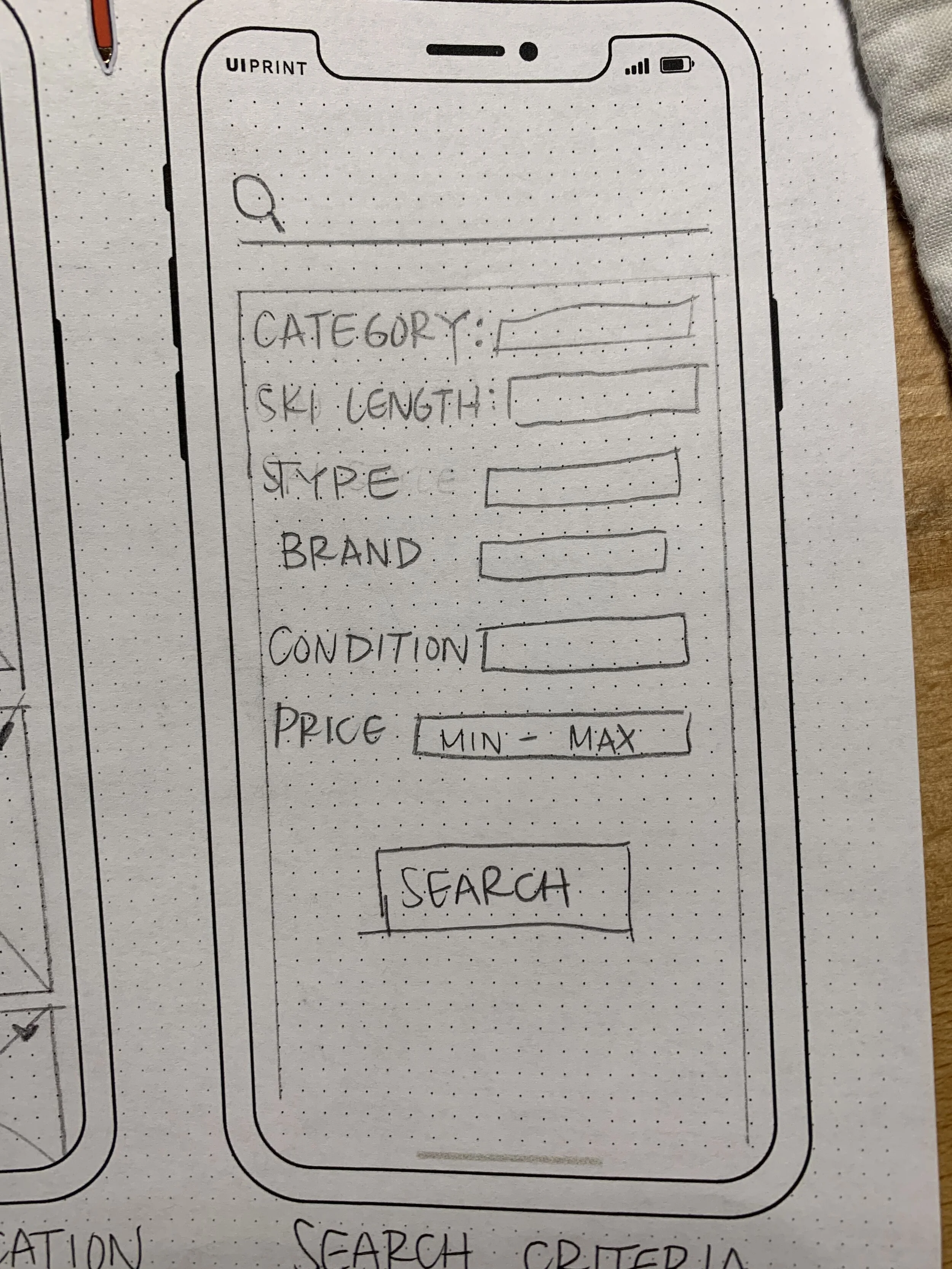
Search Criteria
Two of our three users found the current search criteria lacking since it didn’t allow users to search by ski length or brand, two criteria our users pointed out as being essential
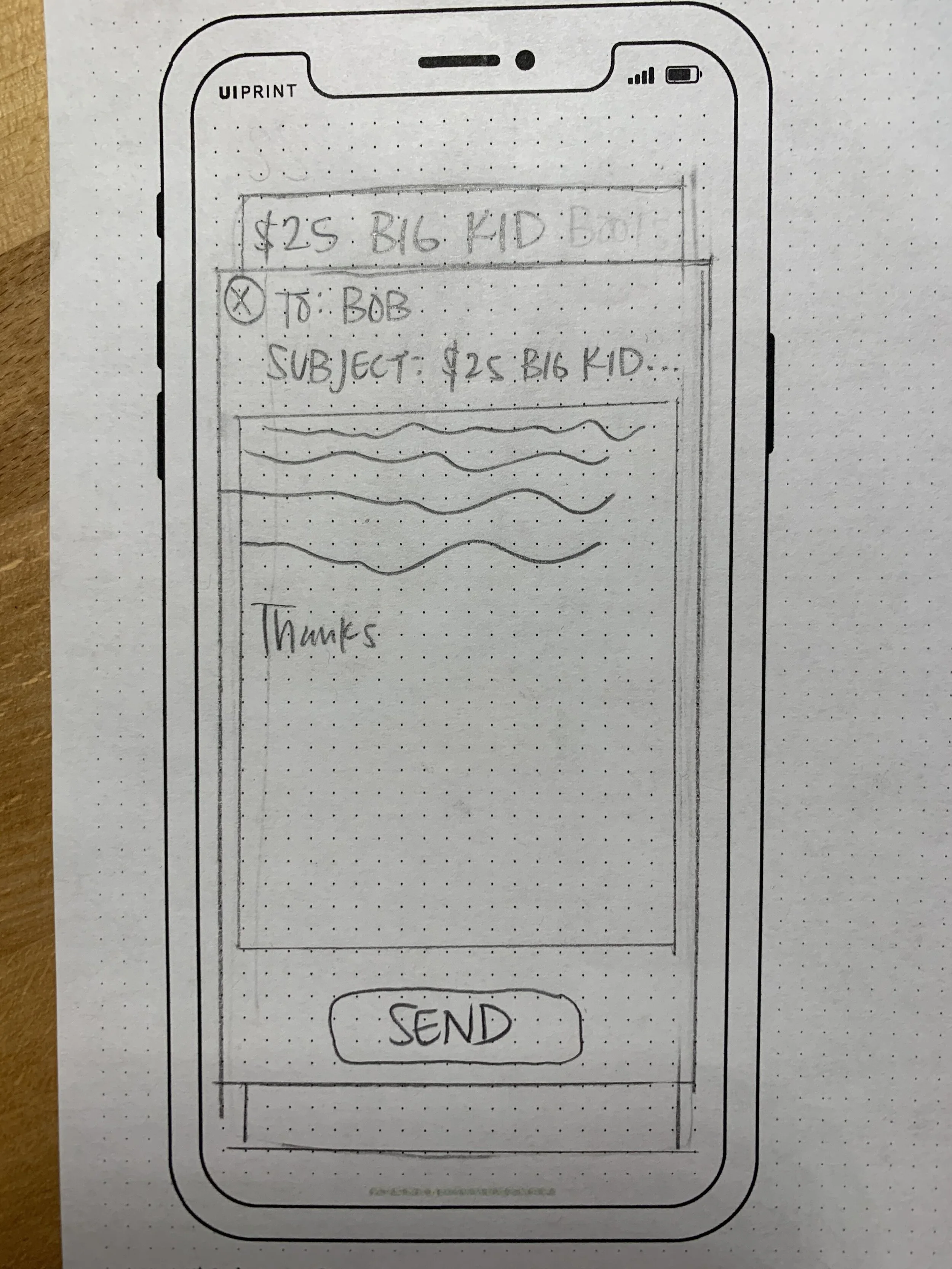
In-App messaging
Usability testers pointed out the ease of being able to message sellers quickly on sites like Facebook marketplace and craigslist. This was pointed out by two of the three users as a necessity in the app.
Results: Proposing improvement for symbiotic usership

Search Bar
The search function only exists within a swap. To make sure people can easily see it I place it where a user would typically expect to see a search function, utilizing common iconography to signify it is the search function.

Search Criteria
The current search criteria does not match with the listing criteria. User testers noticed this during the cognitive walkthrough. The new search criteria matches with what is needed when listing an item for sale.

In-app messaging
Buyers can easily message sellers through the listing and have an inbox that shows a photo of the person who has emailed them and a photo of the gear, so users don’t have to remember the gear they had messaged someone about.
This inbox concept was taken from Depop, which utilizes a similar layout for their resale site.
To take a tour of the app improvements for yourself, check out the working prototype here.