
Northstar Behavioral Health
Client: Northstar Bevaioral Health, A professional inpatient/outpatient treatment program that specializes in opiod dependency. Northstar meets patients where they are on their journey, to get them the help they need
Challenge: Create a multi-touchpoint strategy for Northstar for them to reach people who need their help more easily with the creation of a patient portal, after-care app, text-based services, and a way to better leverage their street team.
Methodology:
Comparative Analysis
Hi-fi Wireframe Prototypes
Anotated wireframes
Tools:
Sketch
Figma
Google Slides
Goals: Create a multi-touchpoint system that includes digital and in-person assets for individuals to get in touch with Nortstar the very moment they want help.
My role: Research, wireframing main screens for the app (see below for exact work)

Research: Wellness apps
Our stakeholders told us multiple times how much they loved the Peloton app and the community it fosters. They wanted their app to have a similar vibe as the Peloton app, with features other wellness apps utilize to foster mindfulness and healing.
I evaluated five wellness apps on the same criteria:
Sign up flow
The overall look of the app
What pulls you in?
The mood of the classes offered and if they made you want to list/stay for the whole class
The ease of accessing services (or care)
Variety of class and length. Was there are a variety of options to meet people where they are?
The information collected from this analysis helped inform the direction the app should take and how to best serve potential members of the Northstar community.
Strategy:
Our client’s goal was to meet more people where they are on their journey, and help them before they hit rock-bottom. Creating a sense of safety for these individuals through all our touchpoints was a high priority. We focused on improving accessibility to recovery and naloxone resources, support resources, and fostering community beyond initial treatment by including virtual counseling, group sessions, and community events.
To better communicate all of the touchpoints, a touchpoint map was created.

Wireframing the app
Brimming with ideas and short on time, I opted to not start with low-fi wireframes and went straight to digital wireframes. This had more to do with wanting to get my ideas out faster and spend less time on mid-fi wireframes. Below are the screens I created for the Northstar app.

QR Code Screen
The team I worked with established a QR code as a quick way for folks to find out more about Northstar. When you scan the QR code this is the first screen you are taken to.

Opening app screen
When you first open the app, this is the screen you see. For folks wanting to get help, they are connected with a counselor via the phone.

What you can do
Making sure folks could access a wealth of resources easily was important. Using language that is reassuring and encouraging was an important part of building out the app.
Wireframing Cont.
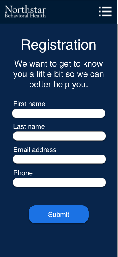
Registration
To make it easier for people to register for the app, we required either a phone number or an email address. People can put both in if they have it.

Home screen
After logging in, you are able to access a number of features for assistance. Other features do require you to be a patient. Access to features is turned on via an admin using your email address.

Journaling feature
Journaling is an important part of mental health. To foster folks just getting into journaling, I created a journal feature with prompts that repeat on a quarterly basis. People utilizing this don’t have to type, they can also use voice to text or record voice memos in the app using the prompt.
Summary
The proposed touch-points I created with my team would help foster a larger community among those who seek treatment with Northstar, and lower the barrier for receiving an assessment in a timely manner.