The problem Space: LLCOOLJORG.COM has a lot of great information on it, however the layout did not focus users towards specific information or encourage them to fulfill an ask. This leads to confusion over what the organization is trying to accomplish and what people need to know to get involved with LLCOOLJ.
Let’s Learn Collectively Our Life’s Journey Website redesign
Homepage
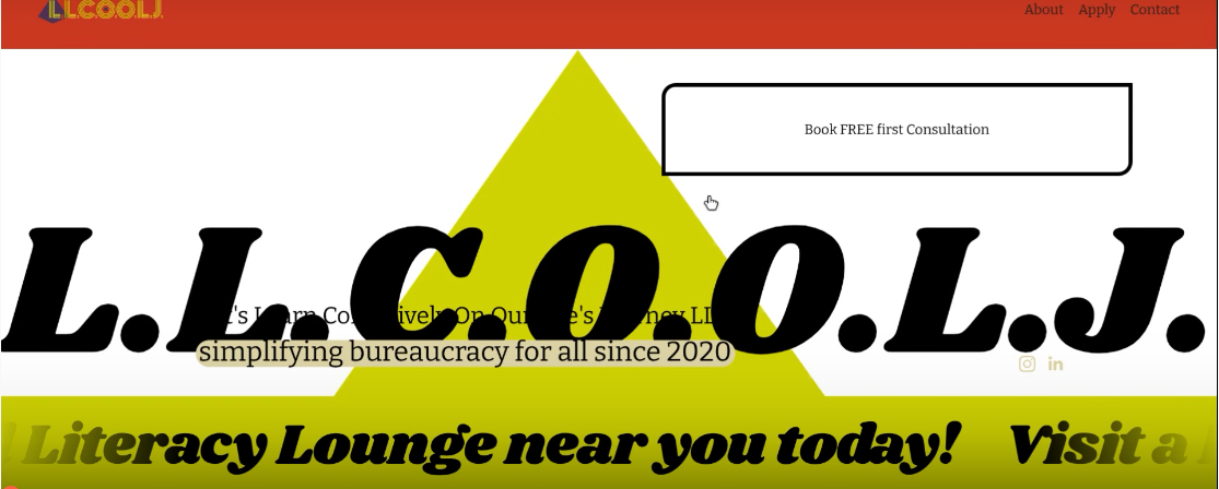
The homepage lacked a focal point, contained multiple moving banners, and contained confusing calls to action.
Before
Calendar
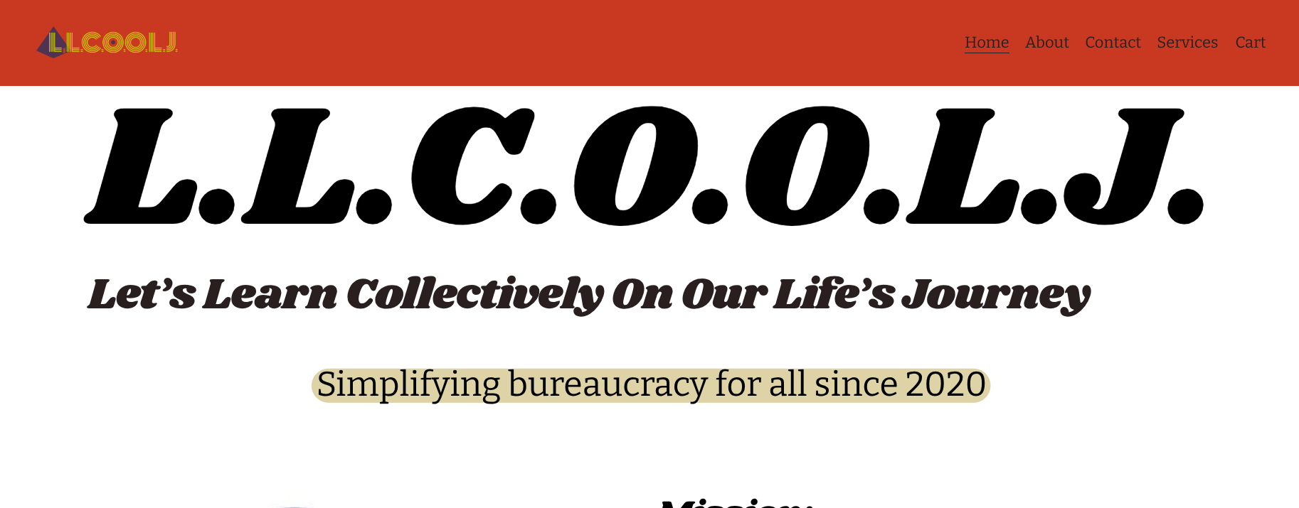
The client wanted a solid background for all pages. I went with white to improve readability. I removed the multiple moving banners to improve the focus of the page
After
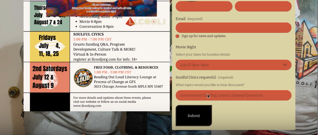
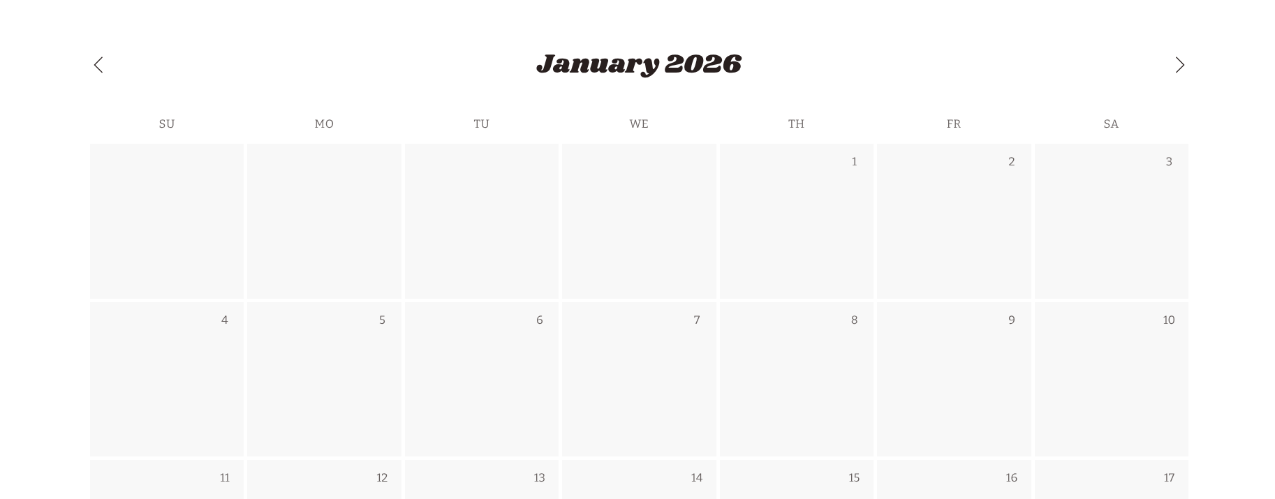
The website had fliers for events but no event calendar, causing considerably more cognitive load on the part of the user.
Before
After
Added an easy to scan calendar so folks can see how to get involved with L.L.C.O.O.L.J.
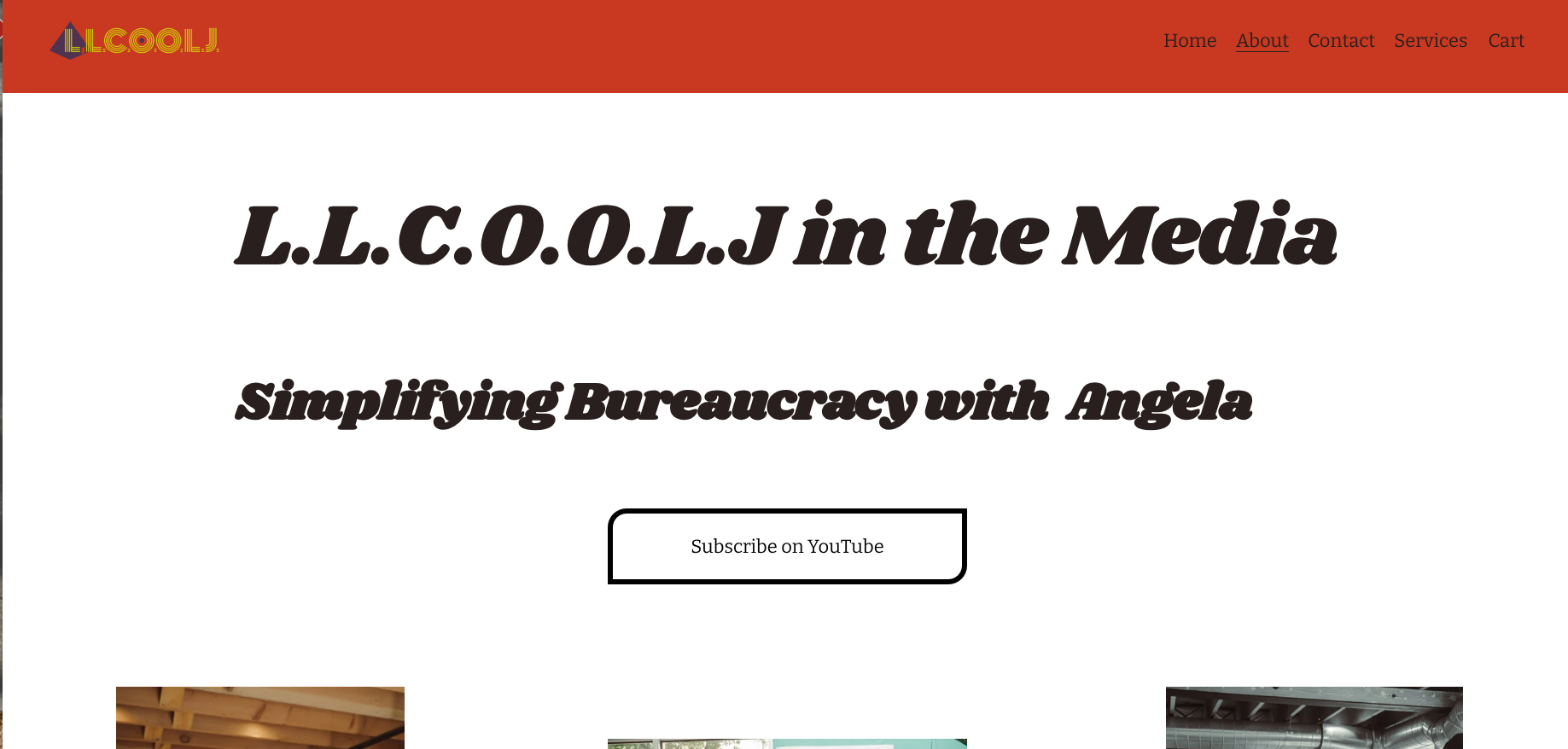
L.L.C.O.O.L.J has a podcast they want to push out to more people. Instead of the podcast being buried at the bottom of the homepage I created a media page under ‘about’.